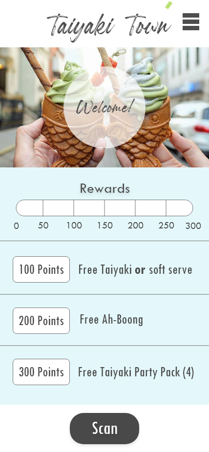
“Taiyaki Town” Rewards App Prototype Design
App splash screen, login screen, and home page.
App navigation menu drop-down, product menu, and individual product menu.
This app prototype was created as a project for an interactive media class I took. For the project, we were tasked with coming up with any kind of app of our choosing. As an avid user of different food rewards apps, I chose to try my hand at designing a very simple yet effective rewards app. I was inspired by one of my favorite taiyaki restaurants near my hometown in California, called Somisomi, and wondered how a rewards app for a taiyaki and soft serve shop might look and operate.
Before jumping into my app, I wanted to research another rewards app and break it down. I chose to go with the Dutch Bros app, as I was living in Utah and frequenting the coffee shop at least weekly and had become very familiar with their app. The app was also brand new at the time, so I knew it would be a good app to deep dive into.
After breaking down the Dutch Bros app, I went to work on designing what I wanted to be a simple and appealing app that would be easy for users to navigate their way through.
Taking inspiration from the Dutch Bros app, I chose a basic blue and white theme that would be simple and easy to look at. I also decided that scan codes that are readily available no matter what page you are on, similar to the Dutch Bros app, is a must for ease-of-access and those like myself who tend to nearly forget about their rewards scan until they’re at the front of the line.
For fonts, I wanted to go with readability first, and style second. For the header font, I chose a font with a brush-stroke style to represent the Asian inspiration and culture that taiyaki and ah-boong originate from. For sub-headers and the body fonts, I chose simple and bold sans serif fonts that are big and easy to read, while also easy on the eyes and keeping the flow of the page going.
Finally, I wanted all of the buttons to clearly represent themselves as buttons that are interactable to avoid any confusion when navigating through the app.
Full prototype image from Adobe XD.


