Sports Team Logo Design and Animation

This project was a final project for a digital design class, where we were tasked with creating two fictional teams with basic mascots and mascot designs, and then creating simple animations of the designs in Adobe Animate. The main focus of this project was not the design of the mascots themselves, as they were meant more to show our skills we had learned so far with using Adobe Illustrator’s tools. So for whatever mascot we chose, we were tasked with just recreating an image of them using very basic colors and simplifying the designs, similar to real-life mascot logos.
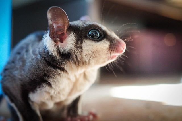
For my team designs, I chose two of my favorite animals: a puffin and a sugar glider. Knowing they already did not exist as mascots, I also wanted to take on the challenge of simplifying how these two animals looked to make them into logos. I chose the two images below as my references, as they were some of the best examples I could find of a side profile of each animal, which I felt would make the best logo designs for each animal. I also went ahead and chose the cities each logo would represent, opting for some alliteration and chose the Seattle Sugar Gliders and Pittsburgh Puffins.

After choosing my reference images, I brought each one into Adobe Illustrator and worked on selecting the basic colors for each animal. For the puffin, I thought the basic white and black would be uninteresting, and may lead viewers to confuse the puffin as a penguin, which while they look similar to each other they are actually not related and are entirely different species! I still wanted to use a characteristic orange for the beak, and decided the use purple instead of the black of the puffin to complement the orange, and kept the white base of the image.
For the sugar glider, I felt it would be better to keep a more black and white look, since sugar gliders have very unique patterns that I wanted to keep, and did not want to make the logo more difficult to look at by choosing a more “wild” color. To complement the neutral colors, instead of a more realistic pink for the nose and ear, I wanted to go with a more neutral brown-orange.
Finally, once I had completed choosing my color palettes, I began to turn each side profile into a vector image, simplifying certain details of each animal along the way to keep them as minimal as possible while also making sure they were recognizable. For the puffin, I chose to remove the lines in the beak, but made sure to keep the hinge of the beak and the downturned “sad-looking” eyes that are well-known details of puffins. For the sugar glider, I followed the characteristic dark pattern of the fur as much as possible while still maintaining some minimalism. I then followed the basic shape of the inner ear and nose with the brown color.
After finishing the designs, I brought them into Adobe Animate and created very simple animations of each logo being “dropped” into frame and growing larger, and created larger watermarks of each logo in the background that I also gave a basic animation to with them moving from one side to the other in opposite directions, like a sort of “face off”. I finished it off with a basic animation of each team’s name being revealed and exported the animation into my completed team reveal animation!